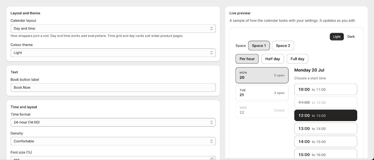
Where styling is set
Open the app and go to Appearance. What you set there applies to every calendar on your store, so you only do it once. The preview beside the settings shows the result straight away.
What you can change
- 1Layout
How shoppers pick a time: Day and time, a Time grid, or Day cards. Day and time is the default and works on every screen size.
- 2Theme
A light or dark calendar. Leave individual colours blank to follow the theme, or set one to override it.
- 3Colours
The accent colour, the column headers, and the colours for available, selected and unavailable times.
- 4Book button
The button colours, its hover state, border and corners.
- 5Time and density
12 or 24 hour times, comfortable or compact spacing, and a font size that suits your theme.
- 6Corners
Rounded corners set separately for time slots, day cards, price pills, the button and the headers.
- 7Custom CSS
For anything else, add your own rules. Developers can also style from the theme by targeting the booking-calendar classes.
Good to know
Can my developer style it from the theme?
Yes. The calendar renders in normal HTML with no shadow DOM, so theme CSS can target its classes and CSS variables directly.
Do styles apply to every calendar?
Yes. Appearance is set once in the app and applies across your store.